Design Tokens, Components and Patterns Library for Dealer Module Web App
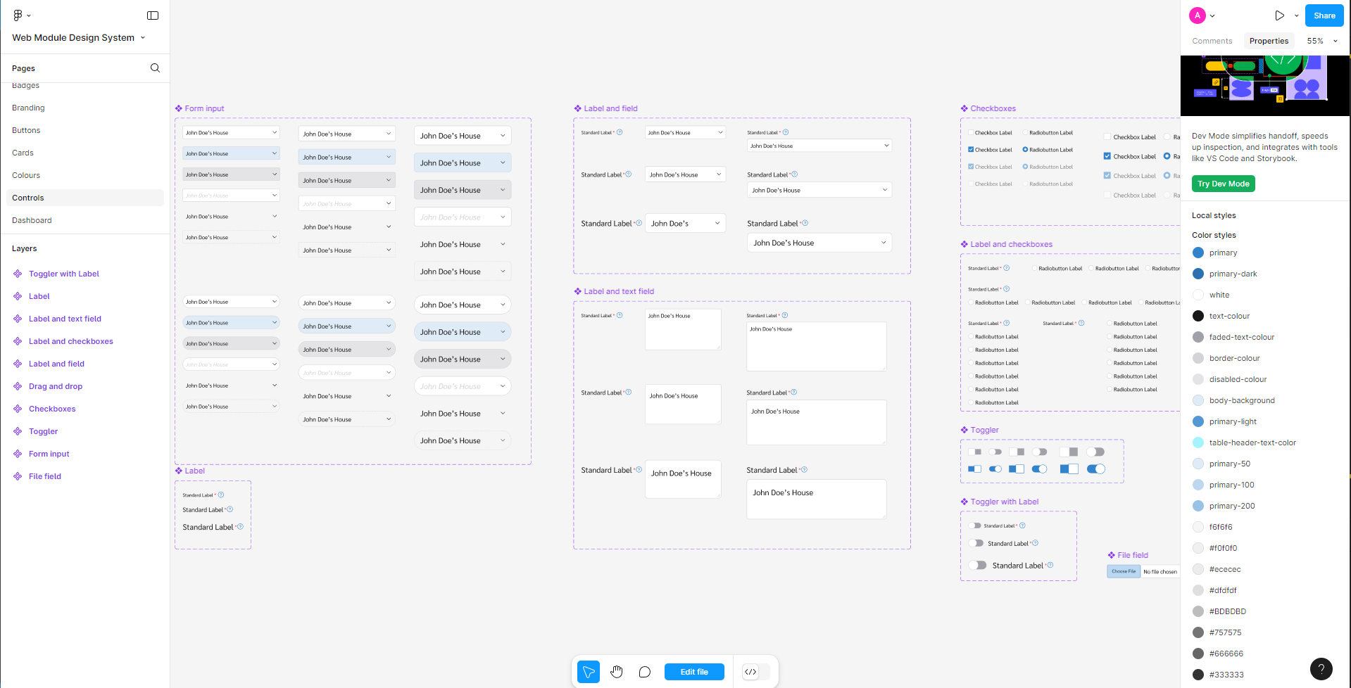
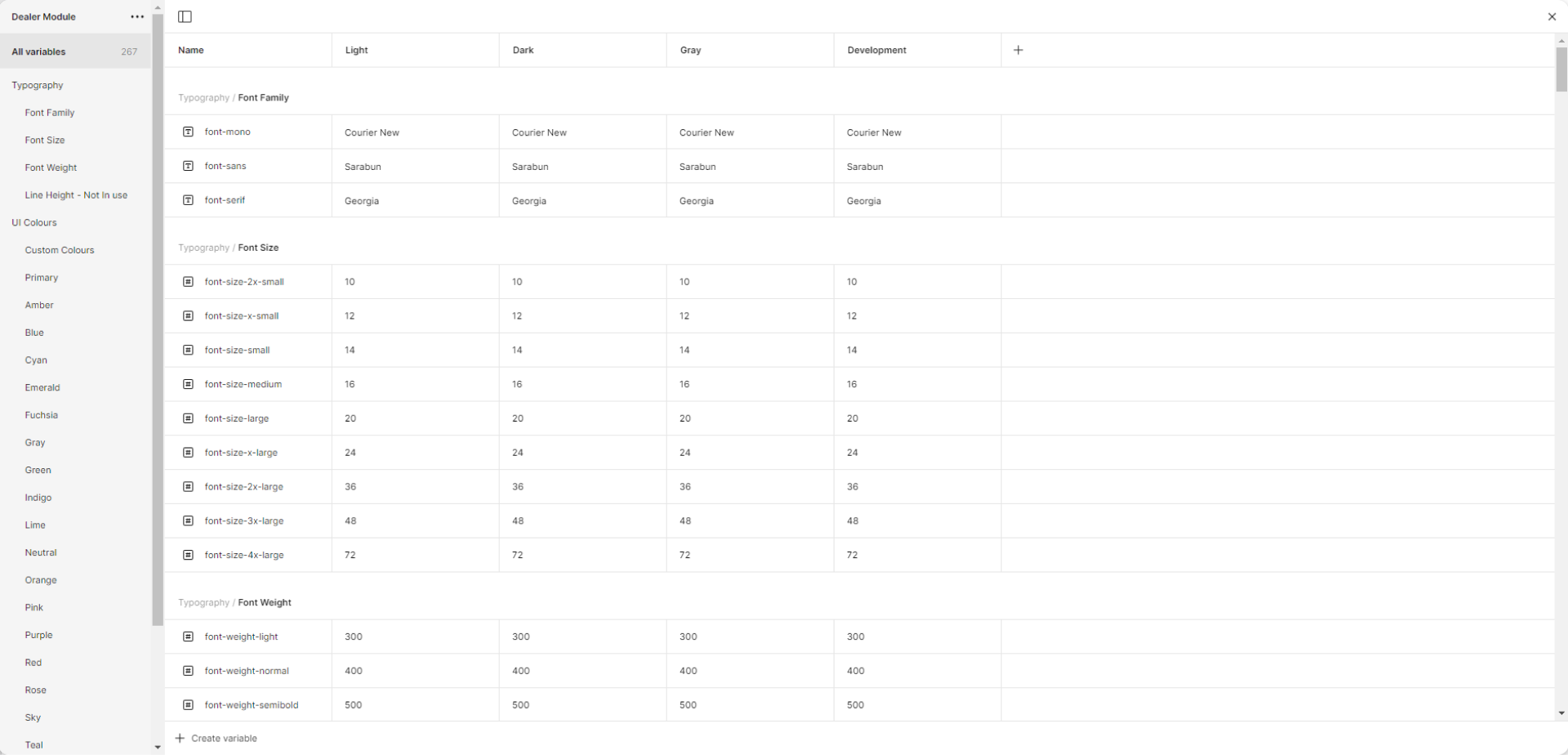
The fundamental principles guiding the creation of the design system were consistency, usability, accessibility, and scalability. I began by defining design tokens and variables for text, color, and spacing, which formed the system's foundation.
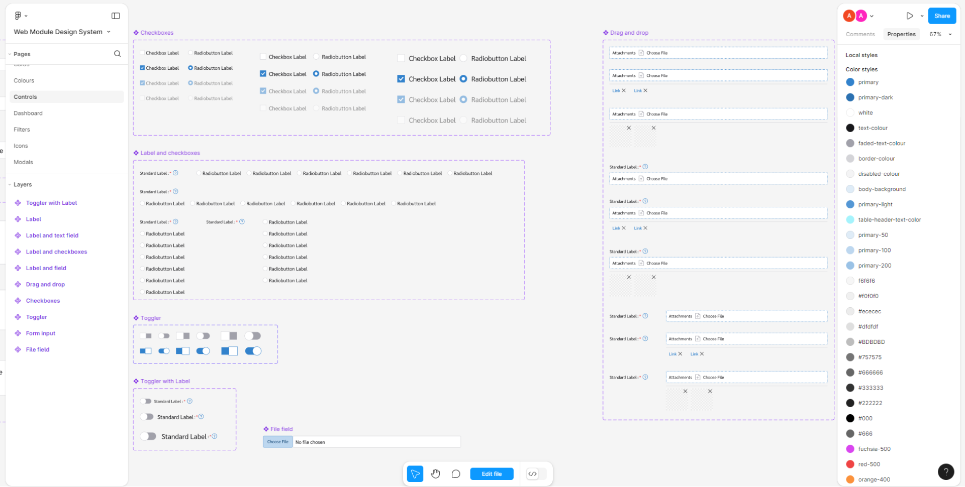
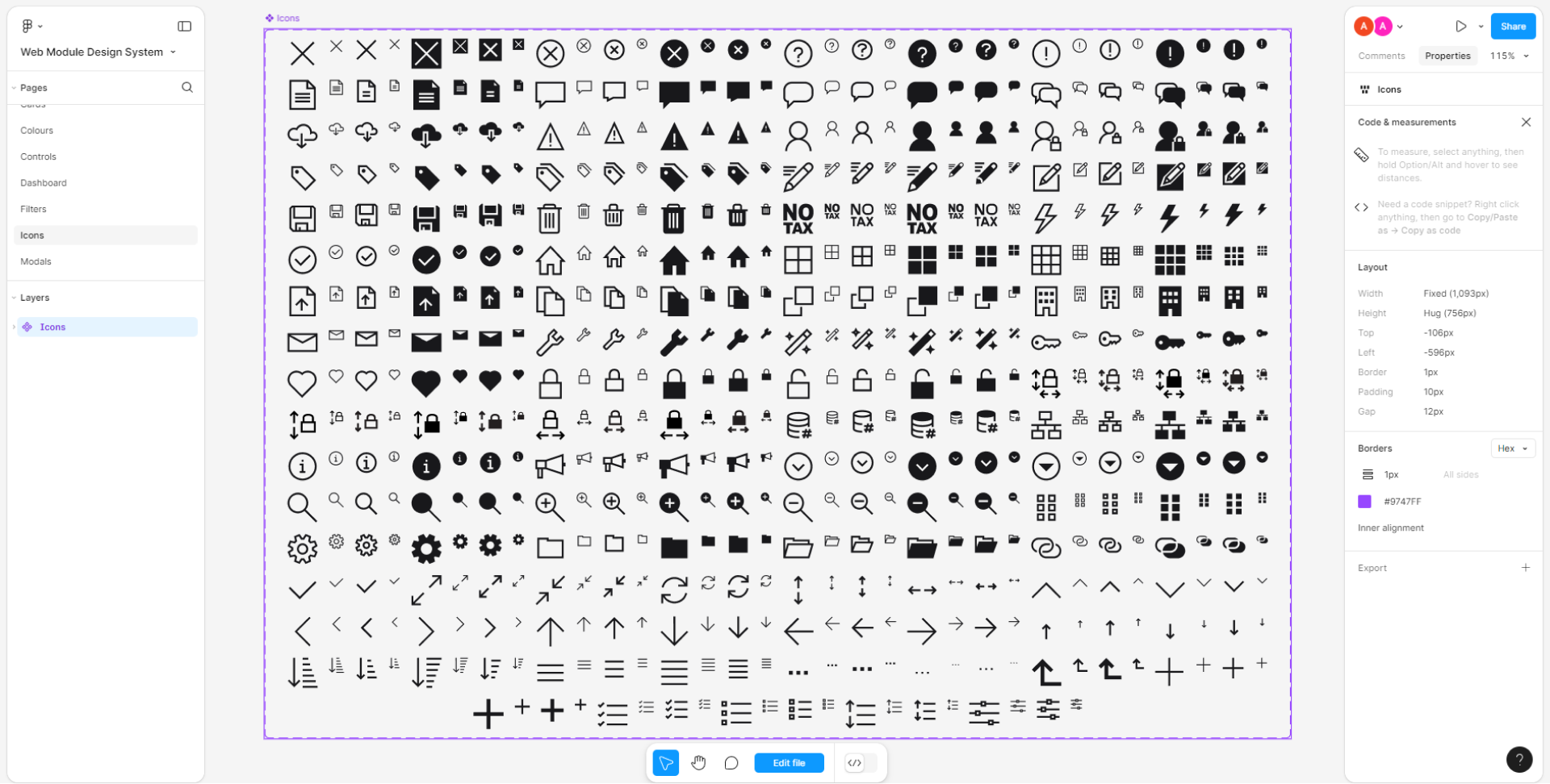
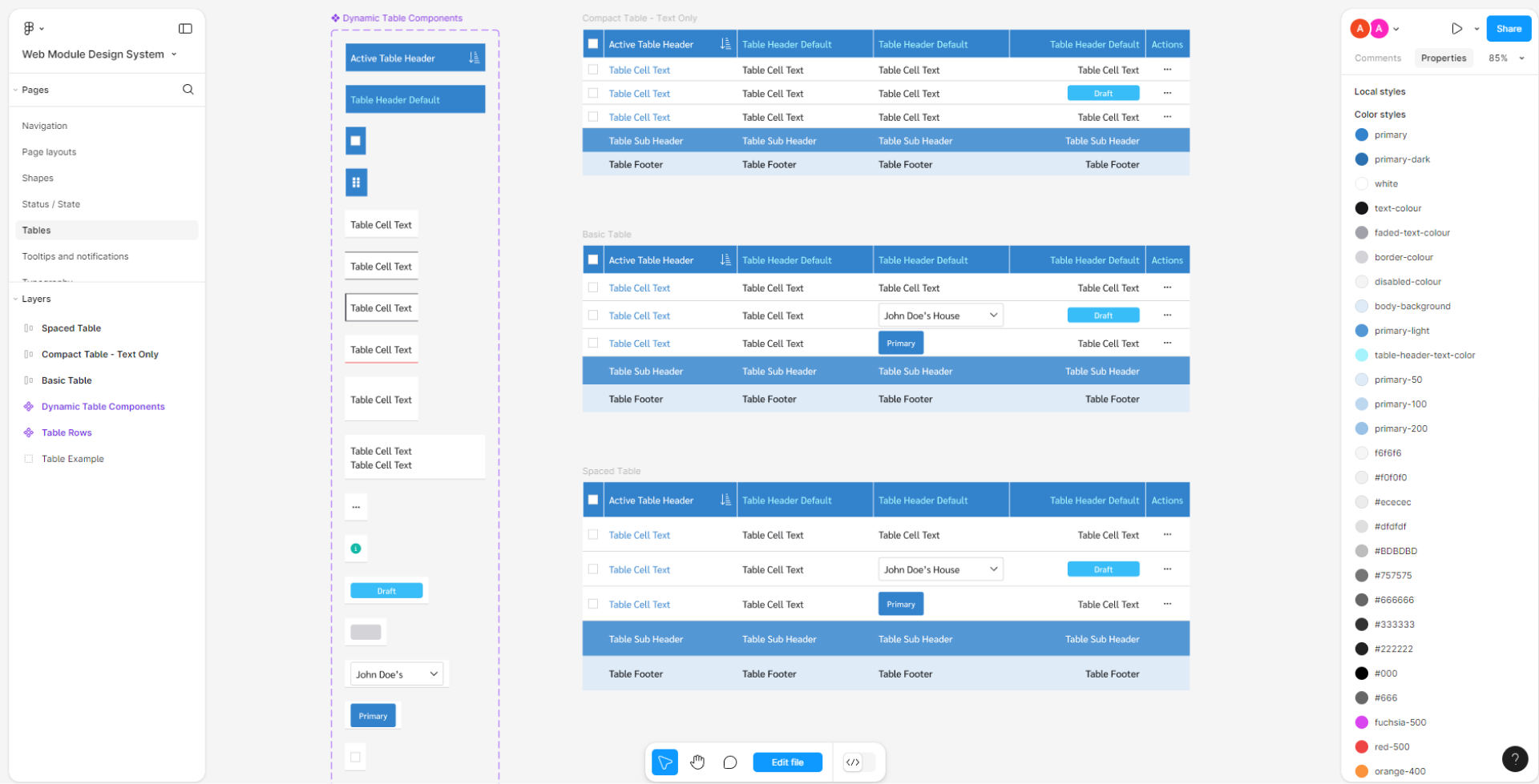
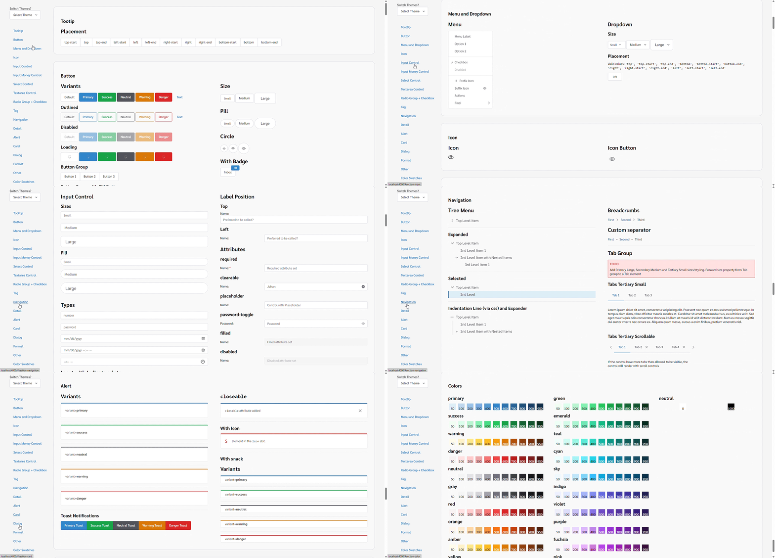
Using these tokens, I developed components such as inputs, buttons, and navigation elements. These components were then combined into patterns for larger elements like tables and navigation bars. Finally, I assembled these patterns into larger sections, including forms, dashboard widgets, and pages. Figma’s features, such as variables, auto-layout, and variants, facilitated the creation of components that closely resemble their coded counterparts.
The process of creating components and design tokens in the Dealer project involves using TypeScript and SCSS for efficient and maintainable development.
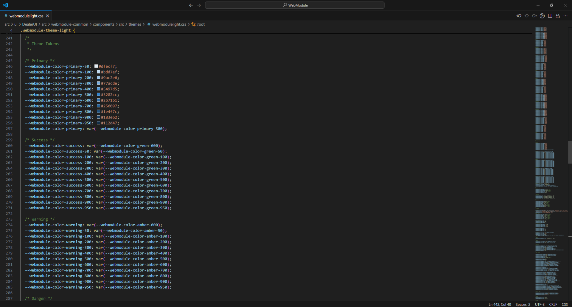
First, I defined design tokens in SCSS to establish a consistent design language, including colors, typography, and spacing.
Next, our team created reusable components, ensuring they were modular and easily configurable. Each component leverages the design tokens to maintain visual consistency across the application.
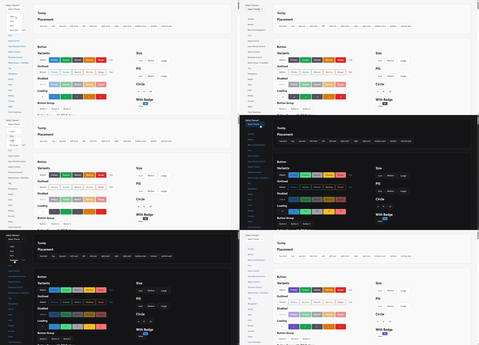
We also developed themes, including light (regular) and dark modes, and the 'development' and 'test' themes to ensure a clear visual distinction across different deployment types.
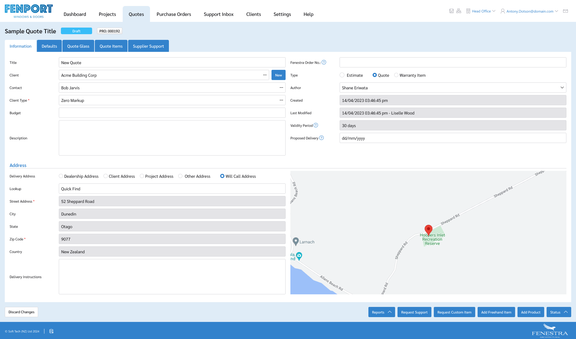
We implemented the new design system in the live application by integrating our reusable components and design tokens. This approach created a user-friendly interface characterized by intuitive navigation and consistent visual elements. The system is scalable, enabling easy addition of new features without disrupting the overall look. By maintaining consistency across user interactions, the design system enhances usability and supports future growth.
To ensure the effectiveness of the new design, we conducted successful user testing. Feedback indicated that users found the interface easy to navigate and visually appealing, with an intuitive layout and clear organization of information. This positive response confirmed our design choices and provided valuable insights for future improvements, ensuring the application continues to meet user expectations.
