V6 3.8 Redesign

Desktop application for fenestration industry manufacturers
My Role
Prototyping, Visual Design, Style guides, Icons set design
Practices
Human-Centered Design Methods, In-person Interview, User Testing
Team
Product Owner, Product Designer, 2 Engineers, QA Test Analyst
Tools
Figma, Miro, Adobe Illustrator
V6 3.8 Redesign
What is V6 application?
V6 is a desktop application designed for window and door manufacturers and dealers. It helps users create custom product configurations, set prices, and manage quotes easily. The software speeds up the sales process and improves order accuracy while handling complex product designs. V6 is flexible, scalable, and can integrate with other business systems, making it a good choice for companies wanting to improve their sales and manufacturing processes.
Background and problem

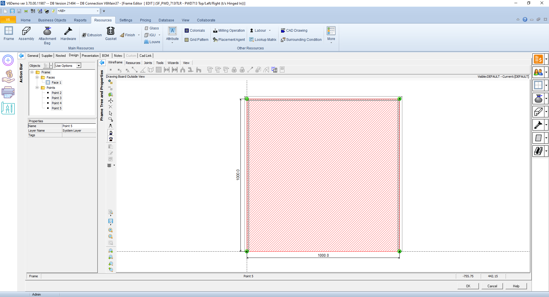
The product's interface needed a more modern and stylish look. The current design felt outdated, like something from the 1990s, with mismatched icons and old-fashioned elements. Even though the product worked well, the design needed improvement.

My task was to refresh the interface with a more up-to-date look. I updated the colors and design elements to make it feel current and added a few features to improve usability. I also ensured consistency by using the same icons and design elements throughout.

In the end, the new design not only looked modern and cohesive but also kept the product efficient, giving users a better and more enjoyable experience.

Original V6 3.7 UI
Redesign process and iterations

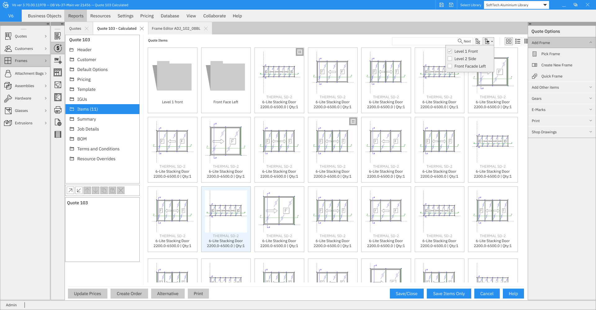
In the V6 redesign process, I focused on improving the user interface by gathering feedback through multiple iterations. I worked closely with users to understand their pain points and needs, using their insights to guide each design update. After each version, I tested the interface with users to see what worked well and where improvements were needed. This iterative approach allowed me to refine the design based on real-world feedback, ensuring that the changes were both practical and user-friendly.

A key part of the redesign was enhancing color contrast to improve visibility and accessibility. I also focused on maintaining consistency throughout the interface by standardizing icons, forms, and other design elements. This helped create a more cohesive and professional look, while ensuring that the product remained easy to navigate. Each iteration brought the interface closer to a modern, functional design that better supported the users' workflow.
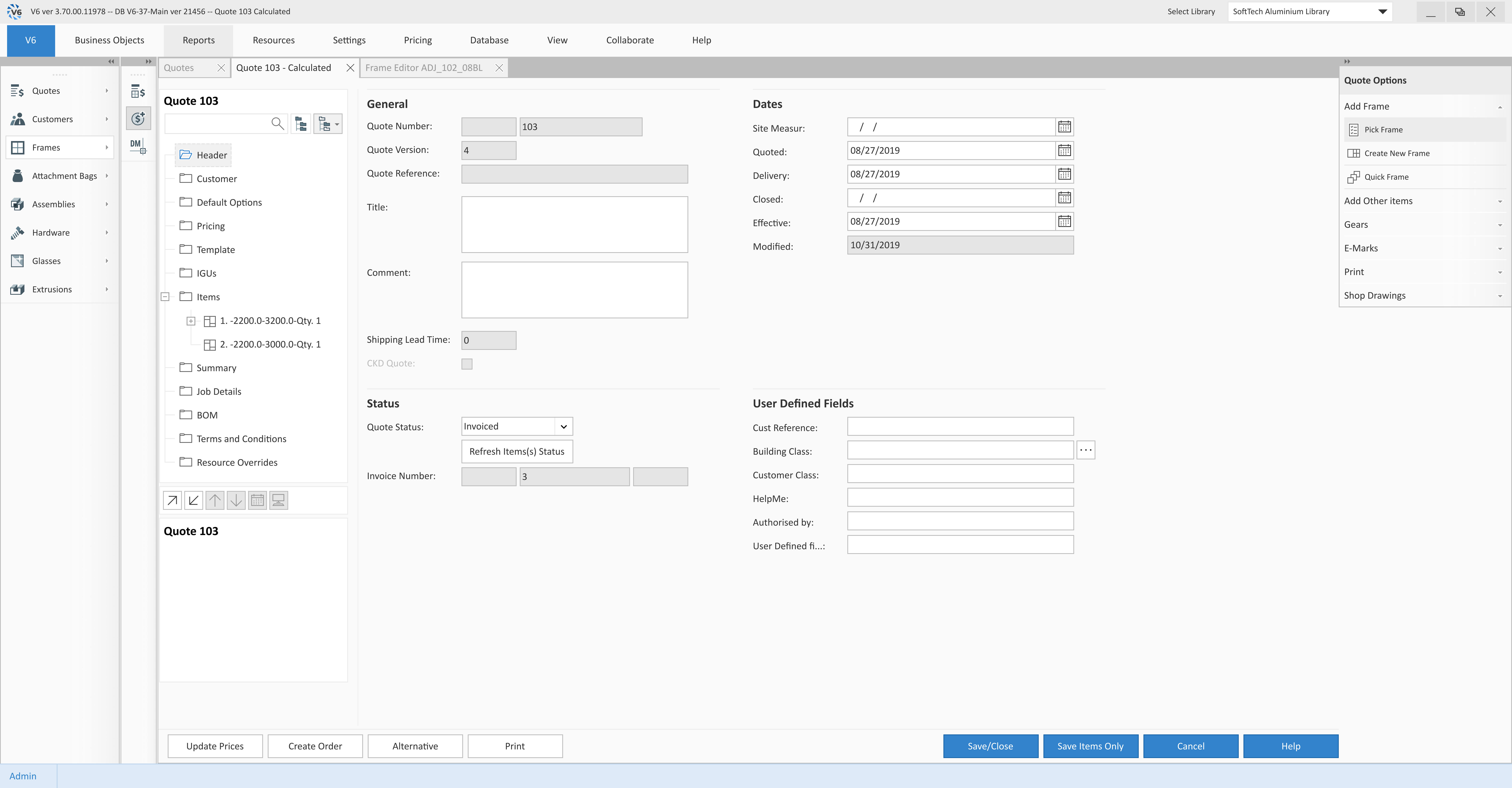
First Iteration - Quote Information
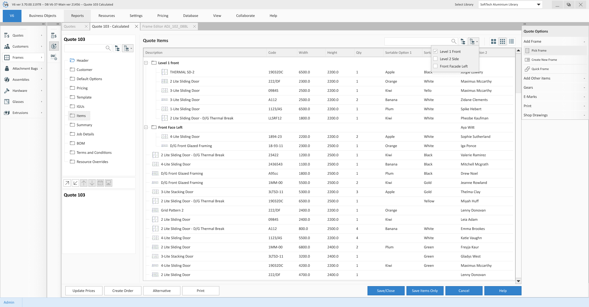
First Iteration - Quote Items
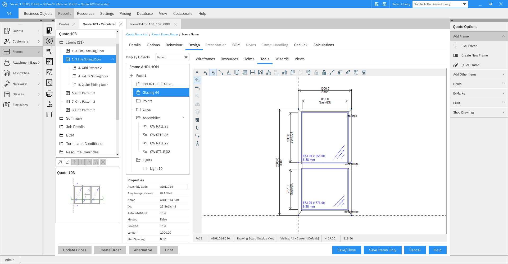
Final UI Version
The result of initial iterations of the redesign was successful overall, with positive feedback on the modern look and improved usability. However, some users mentioned that the new design felt too bright, which made it harder to focus during extended use. This feedback helped guide the adjustments for the next iteration.
Final version - Frame Configuration
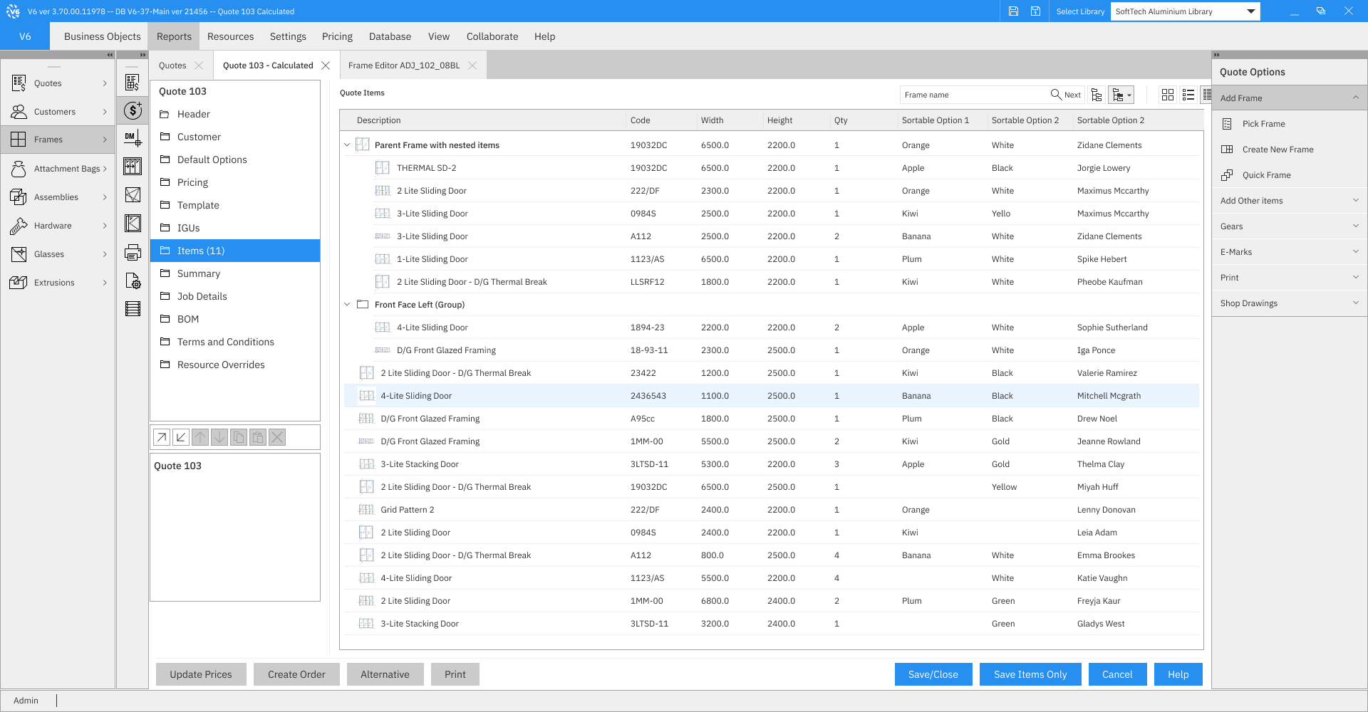
Final version - Quote Items
New Features
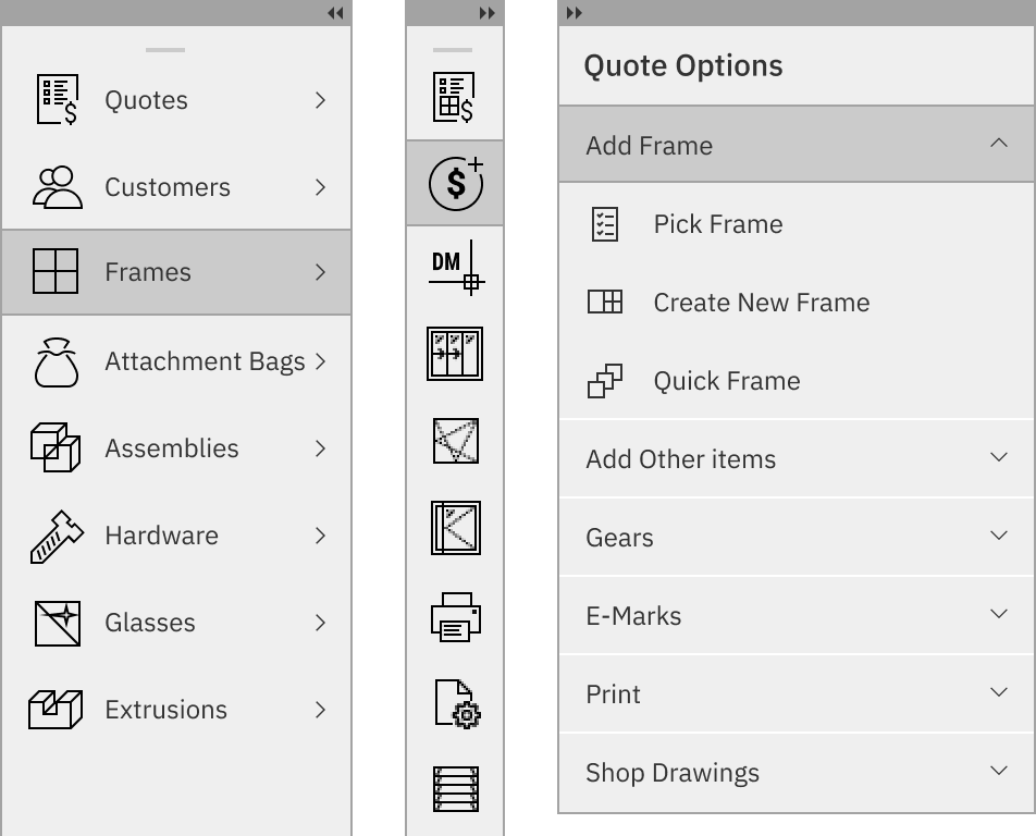
I replaced the Ribbon bar with a Dropdown Menu to simplify navigation and reduce clutter. The Ribbon took up too much space and had many icons, including user-defined ones, making it hard to keep the interface consistent. The Dropdown Menu offers a cleaner, more organized solution, making it easier for users to access key functions without overwhelming them.
The new Tabs feature displays an additional bar showing all opened documents. This simplifies navigation, allowing users to switch between documents easily and enhancing their workflow.
The "Collapsible Customizable Floating Panels" feature allows users to place tools where they prefer and collapse them to save space in the interface. This flexibility enhances usability by keeping the workspace organized and freeing up room for other UI elements.
Feedback and impact
We’ve gathered lots of positive feedback from our customers through usability testing and interviews with users.
Users Preference
We conducted usability tests and gathered feedback from users and stakeholders to ensure the new UI meets their needs. For instance, within the first 2 months of its release, 86% of our existing clients transitioned to the new version, indicating a strong preference for the updated interface.
Increased Efficiency
The addition of new UI functions such as tabs, floating panels, and customizable options, along with the replacement of the ribbon panel with a drop-down menu, has significantly enhanced efficiency and simplified navigation and task execution.
Enhanced Usability and UX
In addition to efficiency gains, the new UI offers improved usability and user experience. Features such as keyboard shortcuts, tooltips for icons, and enhancements to accessibility contribute to a more intuitive and user-friendly interface.