V6 3.8 Redesign
Modernising a legacy desktop application without disrupting 1000+ daily users

V6 3.8 Redesign
Role: Product Designer - Visual Design, Prototyping, Design System, Icon Design
Team: Product Owner, Product Designer (me), 2 Engineers, QA Test Analyst
Company: Cyncly (Formerly Soft Tech) - fenestration industry software provider
Impact Summary
- 86% voluntary adoption within 2 months - users chose to upgrade, not forced
- 15% more screen space for work content by replacing ribbon with dropdown menu
- Zero disruption to existing workflows - maintained muscle memory while modernising
- Unified design language - 120+ custom icons replacing inconsistent legacy assets
The Challenge
V6 was losing deals to competitors with modern interfaces, despite having superior functionality. Sales teams reported that prospects perceived the software as "outdated" and "hard to use" based purely on screenshots - before even trying it.
The business problem: Our 1990s-era interface was creating a perception gap. Clients loved the functionality but were embarrassed to show it to their own customers. New prospects dismissed us in the first demo. The interface was actively hurting sales and retention.
The design challenge: Modernise an interface used by 1000+ people daily, 6-8 hours per day, without disrupting their workflows or requiring retraining. Users had muscle memory built over years - any radical change would trigger resistance and support costs.
Key Constraints
- Can't break workflows - Users had 5-20 years of muscle memory with the current interface
- Limited engineering capacity - 2 developers, couldn't afford a full rebuild
- Delphi application - Built in Delphi, which is very restrictive in terms of UI flexibility. No modern CSS, limited component customisation, UI-driven architecture that makes changes expensive
- Diverse user base - From small dealers to enterprise manufacturers with custom configurations
- Must ship fast - Competitive pressure meant we had 6 months, not 12
Research & Discovery
I interviewed existing V6 users and ran usability testing sessions to understand what was actually broken versus what just looked dated. The goal was to separate aesthetic issues from functional problems.
What Users Actually Said
"It looks like Windows 95, but I know where everything is" - This tension defined the entire project. Users wanted it to look modern but didn't want to relearn anything.
"I can't find tools because the icons are all different styles" - Inconsistent iconography wasn't just ugly, it slowed down navigation.
Strategic Insights
- Familiarity is a feature - Changing layouts would destroy productivity.
- Multiple documents need visual context - Users often worked with 3-5 quotes simultaneously but had no way to see what was open. This led to costly errors when they edited the wrong quote.
- Consistency builds speed - Standardised icons would improve navigation, not just aesthetics.
- Screen space is valuable - On laptops, every pixel of vertical space matters for actual work.
The Approach
Rather than a full redesign, I focused on visual modernisation with strategic UX improvements. Keep the layouts users knew, but fix the visual inconsistencies and add features that genuinely improved workflows.
The trade-off: This wasn't the most exciting design work - no radical reimagining. But it was the right strategic choice for the business and users.
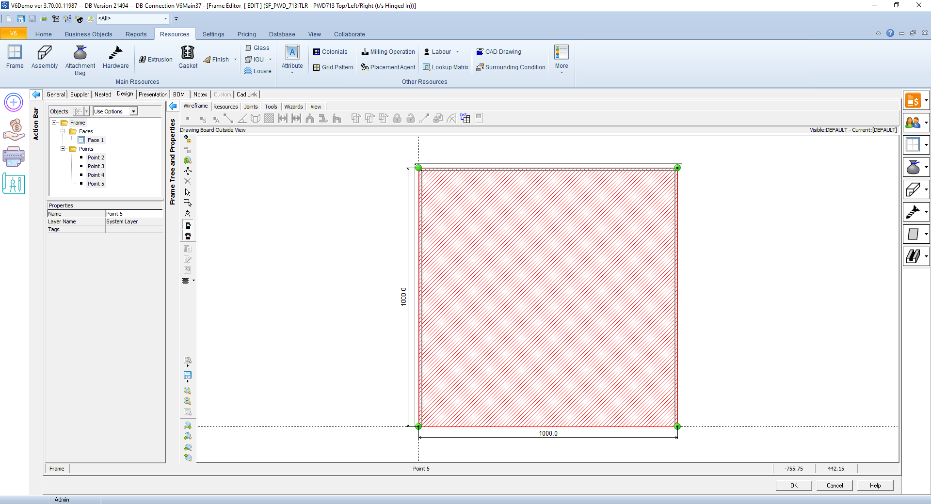 The original V6 3.7 interface - functional but visually dated with inconsistent iconography and poor contrast
Solution & Strategy
My approach was evolution, not revolution. Modernise the visual language, fix real usability problems, but keep the layouts and workflows users relied on.
Strategic Decisions
1. Visual Refresh Without Layout Changes
I updated colours, typography, and spacing to meet modern standards while keeping every button, menu, and panel exactly where users expected them. This meant users could upgrade without retraining.
Why this mattered: The 86% adoption rate proved this was right. Users weren't forced to upgrade - they chose to because it looked better without disrupting their work.
2. Iterative Testing to Validate Brightness
First iteration used bright, clean whites - looked great in screenshots. Users hated it after 2 hours of use. I adjusted to softer tones based on real feedback from extended testing sessions.
The lesson: What looks good in a portfolio doesn't always work in real use. Testing with actual work sessions (not 15-minute demos) revealed the eye strain issue.
3. Unified Icon System
I designed 120+ custom icons following a single visual language. This wasn't just aesthetics - consistent icons improved navigation speed because users could recognise patterns.
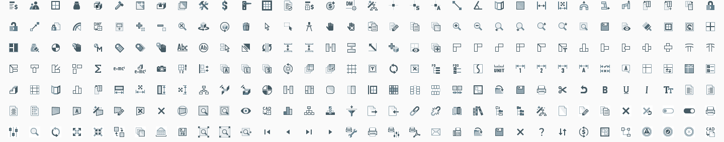 Custom icon system - unified visual language across 120+ icons
4. Strategic Feature Additions
Beyond visual updates, I added three features that genuinely improved workflows - not just because they were trendy, but because they solved real problems users had.
Key Features - Strategic UX Improvements
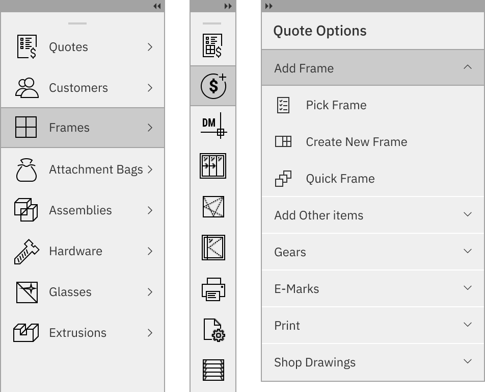
Dropdown Menu Replacing Ribbon
The problem: The ribbon interface consumed 120px of vertical space and became cluttered with user-defined custom icons, making it inconsistent across installations.
The solution: Replaced with a dropdown menu that freed up 15% more screen space while keeping all functions accessible.

Why this mattered: On a 1366x768 laptop (still common in manufacturing environments), 120px is significant. Users could see more quote items, more configuration options, less scrolling. This wasn't just aesthetics - it improved productivity.
The pivot: Initial plan was to replace the ribbon entirely. But some users were too rigid and stuck to familiar patterns - they wanted the ribbon back despite the space benefits. Rather than forcing change, we made both options available in settings. Users could choose dropdown (default) or ribbon based on their preference.
What I learned: Even when data shows one approach is better, some users will resist change. Giving them choice (at the cost of maintaining two UI patterns) was the pragmatic solution that kept everyone happy and maintained the high adoption rate.
Document Tabs
The problem: Users often worked with multiple quotes simultaneously but had no visual indication of what was open. They'd lose track and accidentally edit the wrong quote.
The solution: Added a tab bar showing all open documents with clear labels and close buttons.

Why this mattered: This prevented costly errors. Editing the wrong quote could mean incorrect pricing or configurations going to customers. The tab bar provided visual context that reduced mistakes.
Collapsible Customisable Floating Panels
The problem: V6's flexibility was both a strength and a design nightmare. Users created custom functions, macros, and workflows with their own icons and placed them in unexpected places throughout the UI. This made every installation look different - great for power users, confusing for new users or anyone switching between installations.
The deeper issue: Different users needed different tools visible. Power users wanted quick access to their custom workflows; casual users found them distracting. And we couldn't control where users put their custom tools in the old interface.
The solution: Made panels collapsible and draggable so users could customise their workspace. Power users could have everything visible including their custom tools; casual users could hide what they didn't need. Crucially, custom functions lived in these panels rather than scattered throughout the main interface.
Why this mattered: This kept the core UI clean and consistent for new users while giving power users a designated space for their customisations. When someone opened V6 for the first time, they saw a clean, professional interface - not a cluttered mess of custom icons they didn't understand.
Design decision: Rather than fighting V6's extensibility (which users loved), I designed around it. Give customisation a home that doesn't pollute the main interface. This added complexity to the codebase but solved the tension between consistency and flexibility.
Collaboration & Implementation
With only 2 engineers and a 6-month deadline, I needed to be ruthlessly strategic about what we built. Every design decision had to balance impact against implementation cost.
Working with Engineering Constraints
The challenge: Engineers were maintaining a legacy Delphi codebase while building new features. Delphi's UI-driven architecture meant any design that required architectural changes was off the table. Unlike web apps where you can style anything with CSS, Delphi components have fixed behaviours and limited customisation.
My approach: I learned Delphi's constraints first, then designed within them. For example, the floating panels used existing window management code - I just redesigned the UI. The icon system worked within Delphi's image list constraints. This made implementation feasible within our timeline and budget.
Key collaboration moment: Engineers initially resisted the icon redesign, citing the time to replace 120+ icons. I created a batch export system from Figma that generated all icon sizes and formats automatically, reducing their work to a few hours instead of days. This convinced them it was feasible.
Iterative Testing Process
- Weekly design reviews with engineers to validate technical feasibility before investing in detailed design
- Fortnightly user testing with 5-8 existing users doing real work tasks, not scripted scenarios
- Close QA partnership to ensure consistency across key screens in the application
What made this work: I involved engineers early, before designs were "final". This prevented the classic designer-developer conflict where designs are technically impossible. Engineers became collaborators, not just implementers.
Results & Impact
Quantitative Outcomes
- 86% voluntary adoption within 2 months - users chose to upgrade without being forced
- 15% more screen space for work content by replacing ribbon with dropdown menu
- Zero training required - users upgraded and continued working without support calls
- 120+ unified icons replacing inconsistent legacy assets across the entire application
Qualitative Feedback
From a long-time user: "Finally looks like software from this decade. And I didn't have to relearn anything - everything's still where I expect it."
From sales team: "Demos are so much easier now. Prospects actually comment on how clean it looks instead of asking if it's outdated."
From support team: "We expected a flood of 'where did X go?' calls after launch. We got almost none. Users just upgraded and kept working."
Business Impact
- Improved sales demos - prospects stopped dismissing us based on interface appearance
- Reduced support costs - zero training required meant no support burden from the upgrade
- Competitive positioning - closed the perception gap with competitors' modern interfaces
Key Takeaways
Evolution beats revolution for mature products - Users had years of muscle memory. Radical changes would have destroyed productivity and triggered resistance. The 86% voluntary adoption proved that modernising without disrupting was the right strategic choice.
Context of use matters more than aesthetics - The first iteration looked great in screenshots but caused eye strain after 2 hours. Testing with real work sessions (not 15-minute demos) revealed problems that would have hurt adoption.
Constraints drive creativity - Limited engineering resources and a legacy codebase forced me to design within technical constraints. This led to smarter solutions (like reusing existing window management code for floating panels) rather than ideal-but-impossible designs.
Involve engineers early - Treating engineers as collaborators (not just implementers) prevented the classic designer-developer conflict. Learning technical constraints first meant I designed feasible solutions, not fantasy mockups.
Small improvements compound - 15% more screen space, unified icons, customisable panels - individually small, but together they transformed the experience without requiring users to relearn anything.
Reflection
What Worked Well
- Strategic approach - Evolution over revolution was right for this product and user base
- Iterative testing - Catching the brightness issue early saved us from a failed launch
- Engineering collaboration - Involving engineers early prevented wasted design work
What I'd Do Differently
Gather baseline metrics - I should have measured task completion times and error rates before the redesign. The 86% adoption rate is great, but I can't quantify efficiency improvements without baseline data.
Test with newer users - I focused on existing power users who valued familiarity. Testing with newer users might have revealed opportunities for more significant UX improvements that wouldn't have disrupted experienced users.
Competitive analysis - I should have studied modern desktop applications (not just web apps) more thoroughly. Some patterns I could have borrowed would have improved the design.
Technical Implementation
Design Tools: Figma for design and prototyping, Adobe Illustrator for icon design, Miro for collaborative workshops
Collaboration: Weekly design reviews with engineers, fortnightly user testing sessions, close QA partnership
Accessibility: WCAG AA compliant colour contrast, keyboard navigation support, tooltips for all icons
Icon System: 120+ custom icons designed in Adobe Illustrator, batch export system for multiple sizes and formats
This project taught me that the best design isn't always the most exciting or innovative - sometimes it's the one that solves real business problems without disrupting users. The 86% voluntary adoption rate proved that thoughtful evolution can be more valuable than revolutionary redesign.