Dealer · Product-design decision
Building Dealer’s component library from Figma to code
I built the Figma library and worked with developers on Bootstrap-based components, token imports and shared usage rules.
Project context: Web quoting and ordering for window and door dealers. The wider product covered 200+ screens across dealer and supplier interfaces, support tools, licensing, reports and emails.
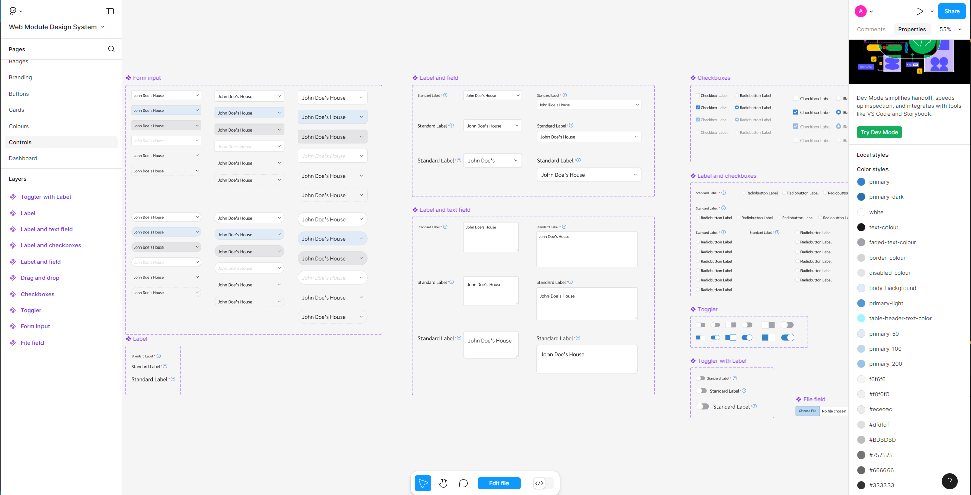
Dealer’s quoting and supplier interfaces shared forms, buttons and other controls. I built the component library from scratch in Figma, defining reusable elements and their states so they could support different screens across the product.
My work was to give the team reusable components and clear usage rules, while keeping the Figma library and coded implementation aligned.
 Inspect image and full context
Building on Bootstrap
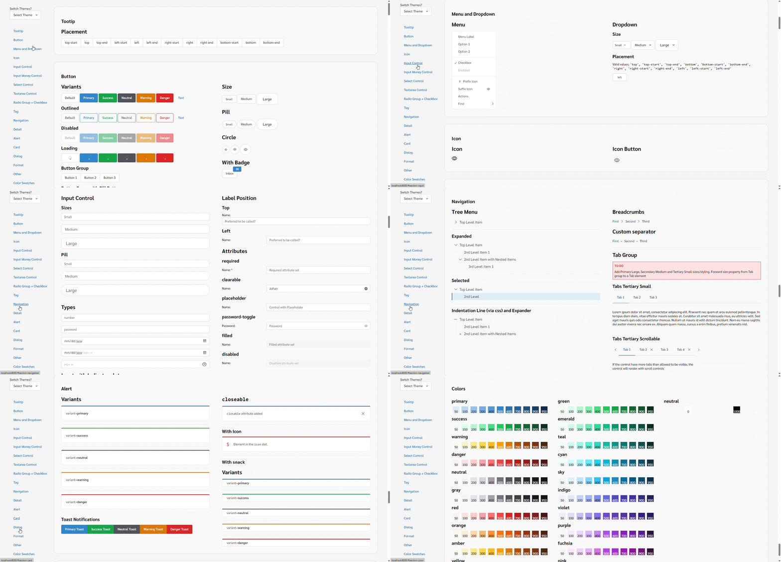
We used Bootstrap as the generic framework during the early stages. I collaborated with developers to match the Figma components and design tokens with their implementation in code.
That foundation made much of the work straightforward and compatible with the framework, keeping the development effort manageable as we established the library.
 Inspect image and full context
Making Figma the source of truth for tokens
Design tokens held shared values such as colours and typography. Once we had matched the Figma and code libraries, we established a way to carry token changes into the implementation.
- Source of truth
- Figma held the shared token values used by the coded library.
- Taking updates into code
- We created a script to import new and updated tokens from Figma into code.
Establishing how components should be used
I primarily established the component rules and usage patterns. These gave developers guidance on how to assemble interfaces consistently, including developers joining the project.
We also considered changes to the library together. When a new requirement arose, we reviewed whether an existing component or pattern could support it, or whether we needed to introduce something new. Those decisions accounted for the trade-offs and constraints of the particular requirement.
The reusable components and usage rules helped new developers build UI with minimal errors and reduced development time. The work combined creating the library with maintaining a shared approach to using and extending it.