Dealer Module Web App
CPQ System for Dealers and Suppliers in fenestration industry

Dealer Module Web App
Role: Lead UX/UI Designer
Team: Product Owner, UX/UI Designer (me), 4 Engineers, QA Test Analyst
Company: Cyncly (Formerly Soft Tech) - fenestration industry software provider
Impact Summary
- 5x faster quote creation compared to previous desktop solution
- Automated paperwork generation, eliminating manual errors and saving hours per week
- Enabled business expansion by making the platform accessible to external dealers for the first time
- Reduced licensing costs for clients by 60% through web-based deployment
The Challenge
Soft Tech's V6 desktop application was the backbone of window and door manufacturers' businesses across New Zealand and Australia. But it had a critical limitation: it was too complex and expensive for external dealers to use.
Manufacturers needed their dealer networks to quote and order products independently, but V6 required extensive training, expensive licenses, and couldn't be delivered over the web. This created a bottleneck where manufacturers had to manually process dealer requests, slowing down sales cycles and limiting growth.
The business challenge was clear: how do we extend V6's powerful configuration engine to external users without overwhelming them with complexity or requiring massive infrastructure changes?
Key Constraints
- V6's codebase wasn't designed for web deployment
- Dealers needed simplicity, but manufacturers needed full product configuration flexibility
- Budget constraints meant we couldn't rebuild V6 from scratch
- The solution had to work for both small dealers (5-10 quotes/month) and large suppliers (thousands of quotes/month)
Research & Discovery
I led research with 12 dealers and 5 manufacturers across New Zealand to understand the current quoting workflow and identify what a web-based solution needed to deliver.
Key Problems Identified
- 0.5-2 hours per quote using phone calls, emails, and spreadsheets
- Configuration errors leading to costly remakes
- 15-20 hours per week of manufacturer time processing dealer requests
- No on-site quoting capability, missing sales opportunities
The Insight
Competitors tried to replicate desktop complexity in web interfaces. The opportunity: Build a platform that hides complexity through smart defaults and progressive disclosure.
Strategic Insights
- Dealers don't need full product knowledge - they need guided workflows that prevent errors
- Speed matters more than flexibility - 80% of quotes use standard configurations
- Trust requires transparency - real-time pricing and order status, not black-box calculations
- Two distinct user types - dealers need simplicity, suppliers need power-user controls
Solution & Strategy
Rather than building a simplified version of V6, I designed a purpose-built interface that treated dealers and suppliers as distinct user types with different needs.
Strategic Decisions
1. Progressive Disclosure Over Feature Parity
Instead of exposing all of V6's configuration options, I created a guided workflow that reveals complexity only when needed. Dealers start with pre-configured frame templates and can drill down into advanced options if required.
Why this mattered: This reduced cognitive load and training time while still supporting edge cases. Early testing showed dealers could create their first quote in under 10 minutes, compared to days of training required for V6.
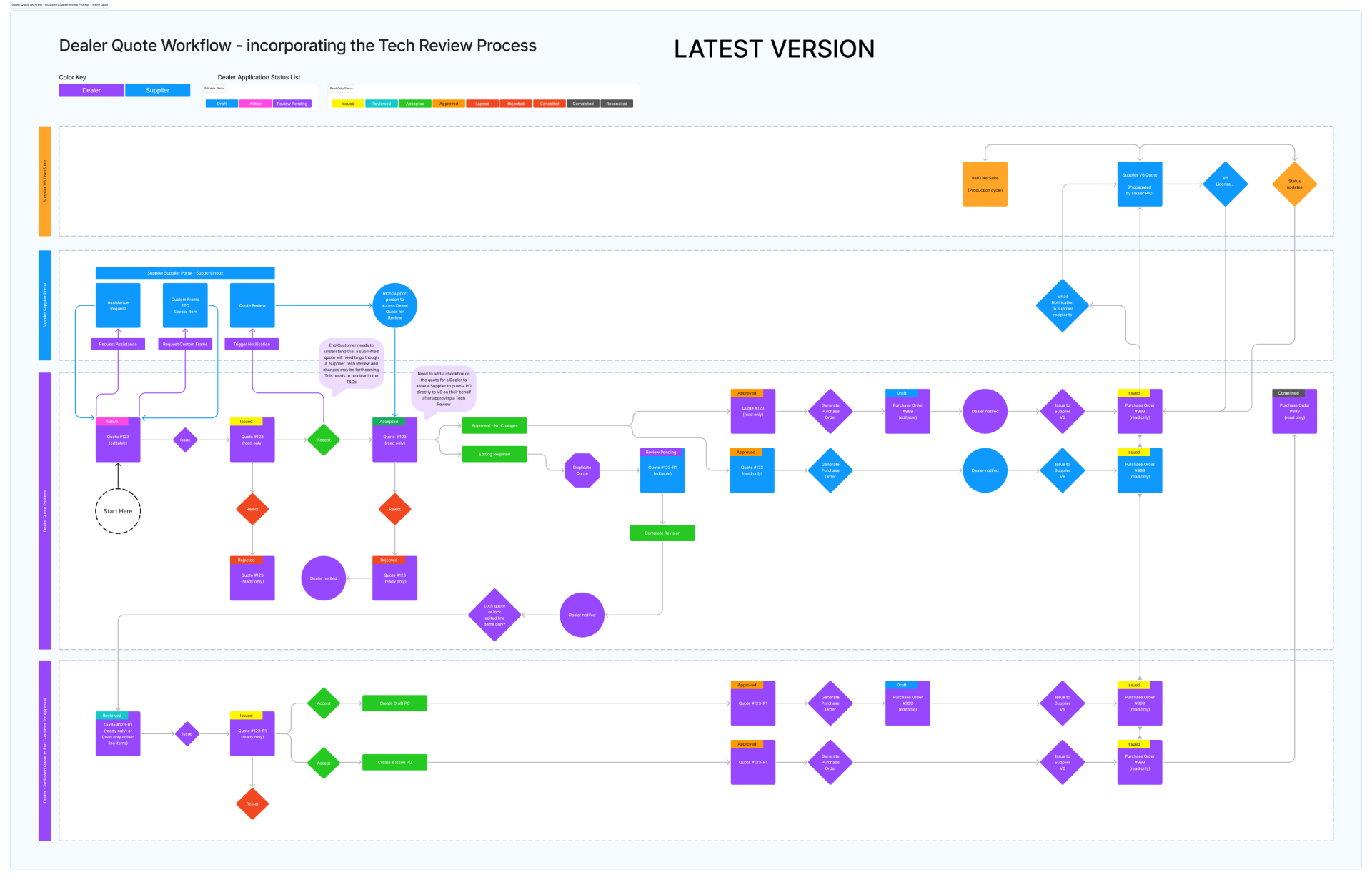
2. Status-Driven Workflows
I designed the quote lifecycle around clear status states (Draft → Review → Approved → Ordered) with automated transitions and notifications. This gave dealers visibility into progress and reduced "where's my quote?" support calls.
3. Dual-Mode Interface
Suppliers needed different capabilities than dealers - managing dealer networks, distributing licenses, and accessing advanced configuration. Rather than cramming everything into one interface, I created a "power user" mode that unlocked supplier-specific features.
The trade-off: This added complexity to the codebase, but user testing validated that trying to serve both audiences with one interface would have compromised usability for both.
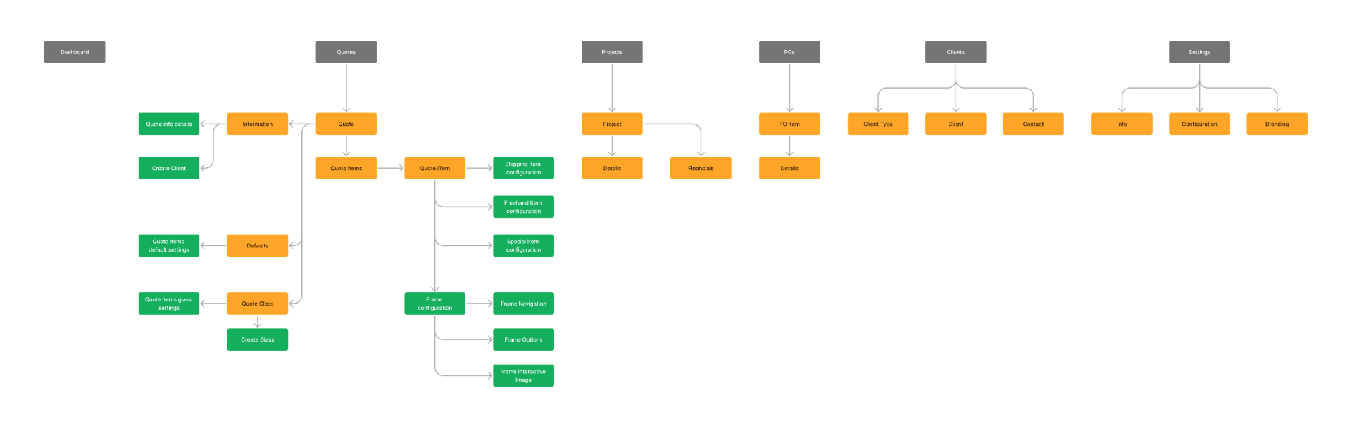
Information Architecture
I mapped out the entire system structure, prioritising the most frequent tasks (creating quotes, viewing orders) while keeping administrative functions accessible but not prominent.
Design Process
I started with low-fidelity wireframes to validate the workflow with users before investing in visual design. This iterative approach uncovered several assumptions that would have caused problems in production.


Key pivot: Initial designs showed all quote items in a table view, but testing revealed dealers needed to see item details and pricing side-by-side. I redesigned this as an expandable summary view that became one of the most-used features.
Implementation & Key Screens
The interface prioritises the most common workflows while keeping advanced features accessible. Here are the core screens that drive the 10x speed improvement:
The quote header provides essential context at a glance - customer details, status, and total pricing. I designed this to be persistent across all quote-related screens so users never lose context.

Collaboration & Iteration
This project required constant alignment between design, engineering, and business stakeholders. I ran weekly design reviews with the engineering team to ensure technical feasibility and fortnight demos with stakeholders to validate we were solving real problems.
Key collaboration moment: Engineers initially pushed back on the expandable quote summary, citing complexity. I built a clickable prototype and ran it past three dealers who all immediately understood it. This evidence convinced the team to invest the extra development time, and it became one of the most praised features.
Results & Impact
Quantitative Outcomes
- 5x faster quote creation: Average quote time dropped from 30-120 minutes to 5-15 minutes
- 90% reduction in configuration errors: Smart defaults and validation prevented most common mistakes
- 15-20 hours saved per week for manufacturer internal sales teams
- 60% lower licensing costs for clients compared to desktop V6 deployment
- Enabled 40+ new dealer onboardings in the first 6 months post-launch
Qualitative Feedback
From a dealer in Auckland: "I can now quote on-site with customers on my tablet. That's changed how I sell - I'm closing deals faster because customers can see pricing immediately."
From a manufacturer: "We've gone from spending half our week processing dealer support requests to focusing on strategic accounts. The support inbox alone has been a game-changer."
Reflection
What I'd do differently: Design mobile-first from the start (some dealers wanted phone access), validate feature demand more aggressively (some reporting tools saw minimal usage as they've been developed for 2 key clients), and build interactive onboarding (dealers needed more product terminology context).
Key Takeaways
- Simplicity is strategic - Hiding complexity through progressive disclosure made the system approachable without sacrificing power
- Dual-mode interface - Serving two user types with tailored experiences beat a one-size-fits-all approach
- Speed is a feature - Dealers prioritised speed over flexibility; this insight shaped every design decision
- Early validation prevents waste - Testing wireframes with users saved months of rework
Building a Scalable Design System
With a small engineering team (4 developers) and complex requirements, I built a design system that accelerated development while maintaining consistency.
The Approach
Design tokens - Semantic tokens (e.g., color-primary, spacing-section) that communicated intent, making it easier for engineers to build without constant design review.
Component library - Reusable components in Figma mirroring code implementation, with props, states, and responsive behaviour.
Theme system - Four themes (light, dark, development, test) to prevent production mistakes and support user preferences.


Impact
- Faster development - Engineers assembled interfaces from existing components
- Reduced cognitive load - Consistent patterns made the system feel familiar
- Instant global updates - Token-based system allowed palette changes in minutes, not days
- WCAG AA compliant - Accessibility built in from the start, not retrofitted
Technical Implementation
Frontend: TypeScript, custom component library
Backend: Integration with existing V6 API layer
Design System: Built in Figma, implemented with reusable components and SCSS
Theming: CSS variables with SCSS for theme switching
Tools: Figma for design and diagrams, Miro for workshops, Axure for interactive prototypes, Adobe Illustrator for icons and graphical elements
The engineering team and I worked closely to build a component library that balanced design consistency with development efficiency. We established a pattern where I'd design components in Figma with detailed specs, and engineers would implement them as reusable React components with TypeScript props for type safety.
This project demonstrated that thoughtful design can transform complex B2B workflows into intuitive experiences. By focusing on user needs, validating assumptions early, and making strategic trade-offs, we delivered a platform that not only solved immediate problems but enabled business growth for our clients.