AGWA Web App
Web application for Australian Glass and Window Association

AGWA Web App
Role: UX/UI Designer
Team: Project Manager, UX/UI Designer (me), 3 Engineers, QA Test Analyst
Company: Australian Glass and Window Association
Impact Summary
- 70% faster data assessment - Auditors reduced review time from hours to minutes with structured data presentation
- Eliminated email bottlenecks - Automated notifications replaced manual back-and-forth between manufacturers and auditors
- Enabled self-service - Consumers could access performance data directly instead of requesting it from manufacturers
- Streamlined compliance - Centralised platform ensured all window performance data met Australian standards
The Challenge
The Australian Glass and Window Association needed a way to manage and distribute window performance data for building compliance. Previously, manufacturers submitted test reports via email, auditors reviewed them manually, and consumers had to request data through phone calls or emails.
The problem: This manual process was slow, error-prone, and created bottlenecks. Auditors spent hours reviewing unstructured data, manufacturers waited days for approval, and consumers couldn't access the information they needed for compliance documentation.
Why it mattered: Window performance data is required for building consent in Australia. Delays in accessing this data held up construction projects, and errors in submissions meant costly re-testing for manufacturers.
Key Constraints
- Multiple user types with different needs (auditors, manufacturers, consumers)
- Complex data structure from simulation software (flat text files with technical specifications)
- Strict compliance requirements for data accuracy and versioning
- Limited budget - needed to deliver core functionality quickly
Research & Discovery
I conducted interviews with 8 stakeholders across three user groups to understand their workflows and pain points.
What We Learned
Auditors (3 interviews) spent 2-4 hours per submission manually checking data against standards. They needed structured data presentation and clear approval workflows.
Manufacturers (3 interviews) submitted 5-15 test reports per month and waited 3-5 days for approval. They needed visibility into submission status and clear feedback on rejections.
Consumers (2 interviews) - architects and engineers - needed quick access to verified performance data for specific window configurations. They were frustrated by the request-and-wait process.
The Insight
Different user types needed completely different interfaces. Auditors needed detailed data views for verification, manufacturers needed simple upload workflows, and consumers needed search and export functionality. Trying to serve all three with one interface would compromise usability for everyone.
Strategic Decision
Rather than building a one-size-fits-all interface, I designed role-specific views that showed only relevant features and data for each user type. This added complexity to the information architecture but dramatically improved usability.
The trade-off: More design and development work upfront, but faster adoption and less training required. User testing validated this approach - each group found their interface intuitive without needing to understand the full system.
Solution & Strategy
I designed a role-based platform where each user type saw only what they needed. Auditors got structured data views for verification, manufacturers got guided upload workflows, and consumers got search and export tools.
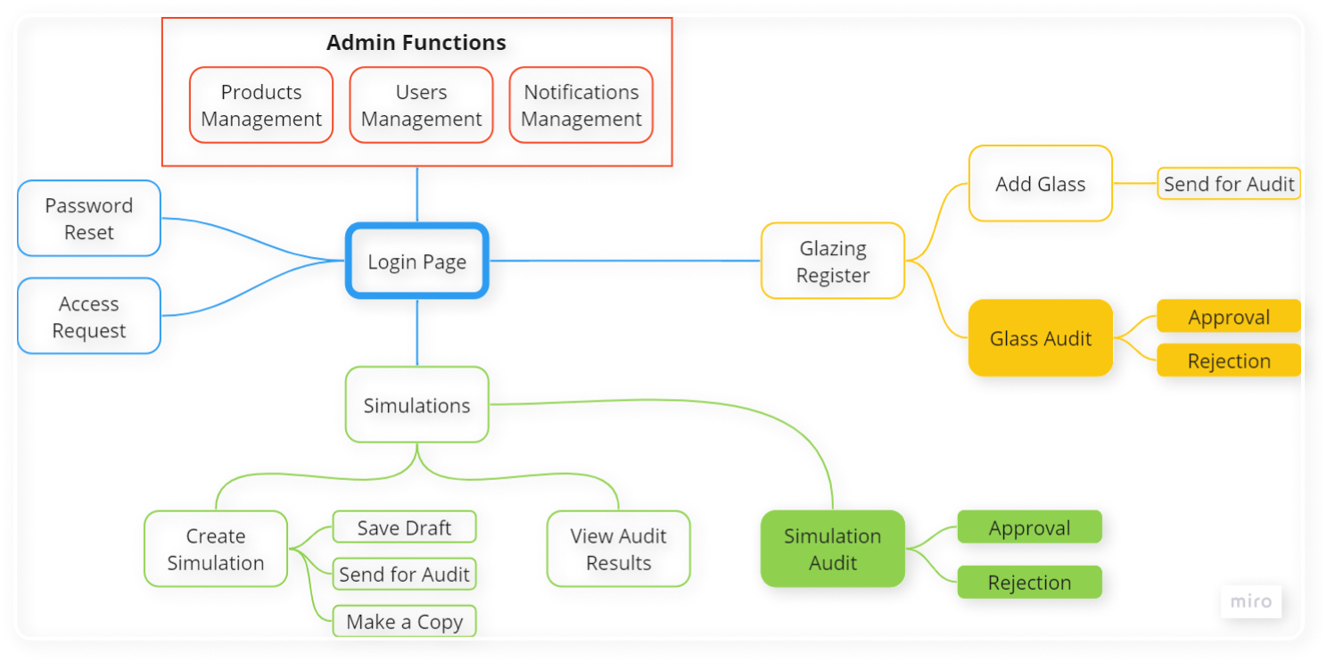
Understanding Roles and Relationships
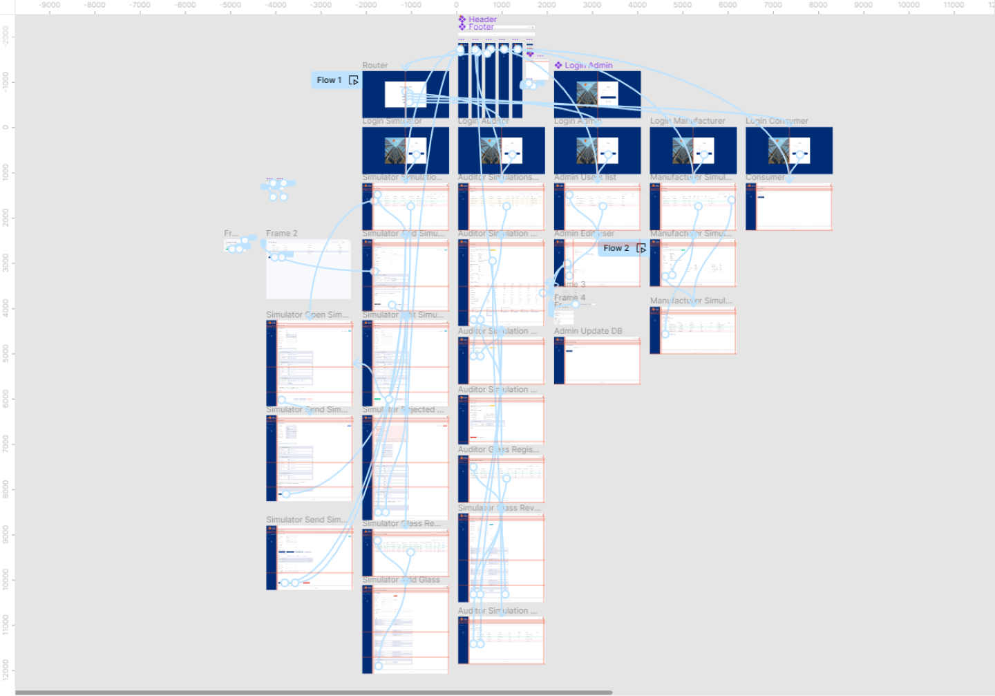
Mapping user roles and permissions was critical. I created diagrams showing how data flowed between user types and what actions each role could perform.


This mapping revealed that auditors needed to see manufacturer details but manufacturers shouldn't see other manufacturers' data. Consumers needed access to approved data only, not pending submissions.
Information Architecture
I organised the application by user role rather than by feature. Each role had a tailored navigation structure that prioritised their most frequent tasks.
Why this approach: User testing showed that role-based navigation was more intuitive than feature-based navigation. Auditors could find review tools immediately, manufacturers could upload data in two clicks, and consumers could search without seeing irrelevant admin features
.
Design Process & Iteration
I started with low-fidelity wireframes in Axure to validate workflows with stakeholders before investing in visual design. This iterative approach uncovered assumptions that would have caused problems in production.
Key Screens
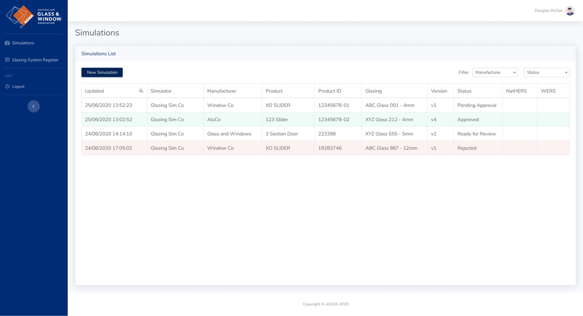
Simulations List - The main dashboard for auditors and manufacturers. I designed this with advanced filtering and status indicators so users could quickly find relevant submissions. The challenge was balancing information density with readability - too much data overwhelmed users, too little required constant clicking.
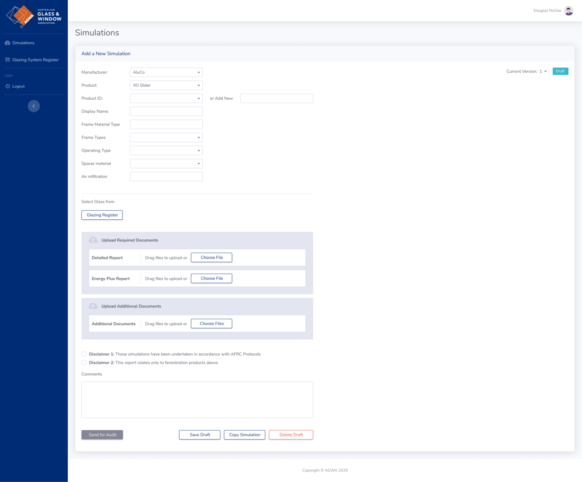
Simulation Request - Manufacturers use this to submit new test data. I designed a guided workflow with validation at each step to prevent common errors. Real-time feedback showed which fields were missing or incorrectly formatted.
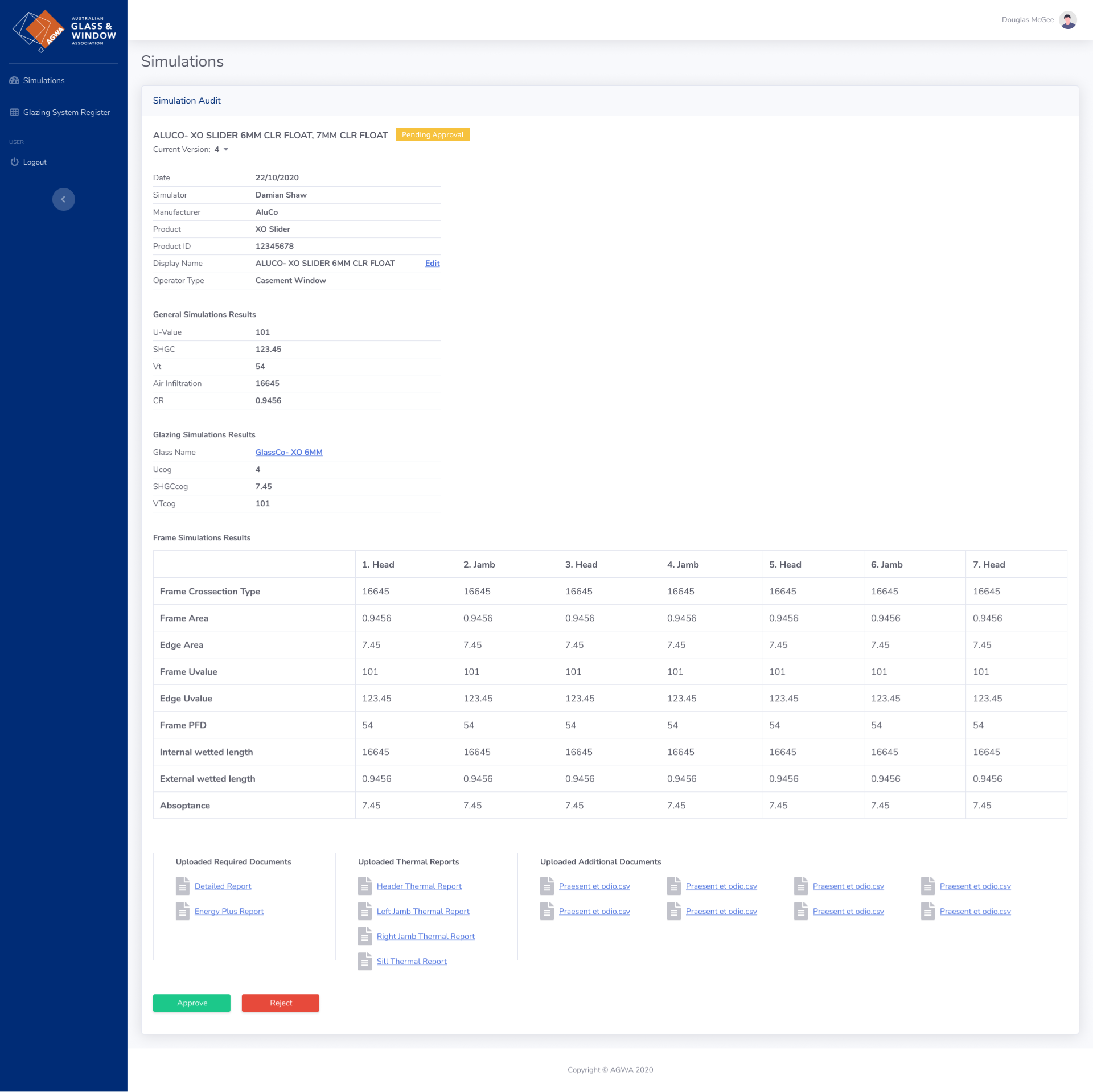
Simulation Audit - Auditors needed to see all submission details, compare against standards, and provide feedback. I designed this as a split view: submission data on the left, standards reference on the right, with approval/rejection controls always visible.
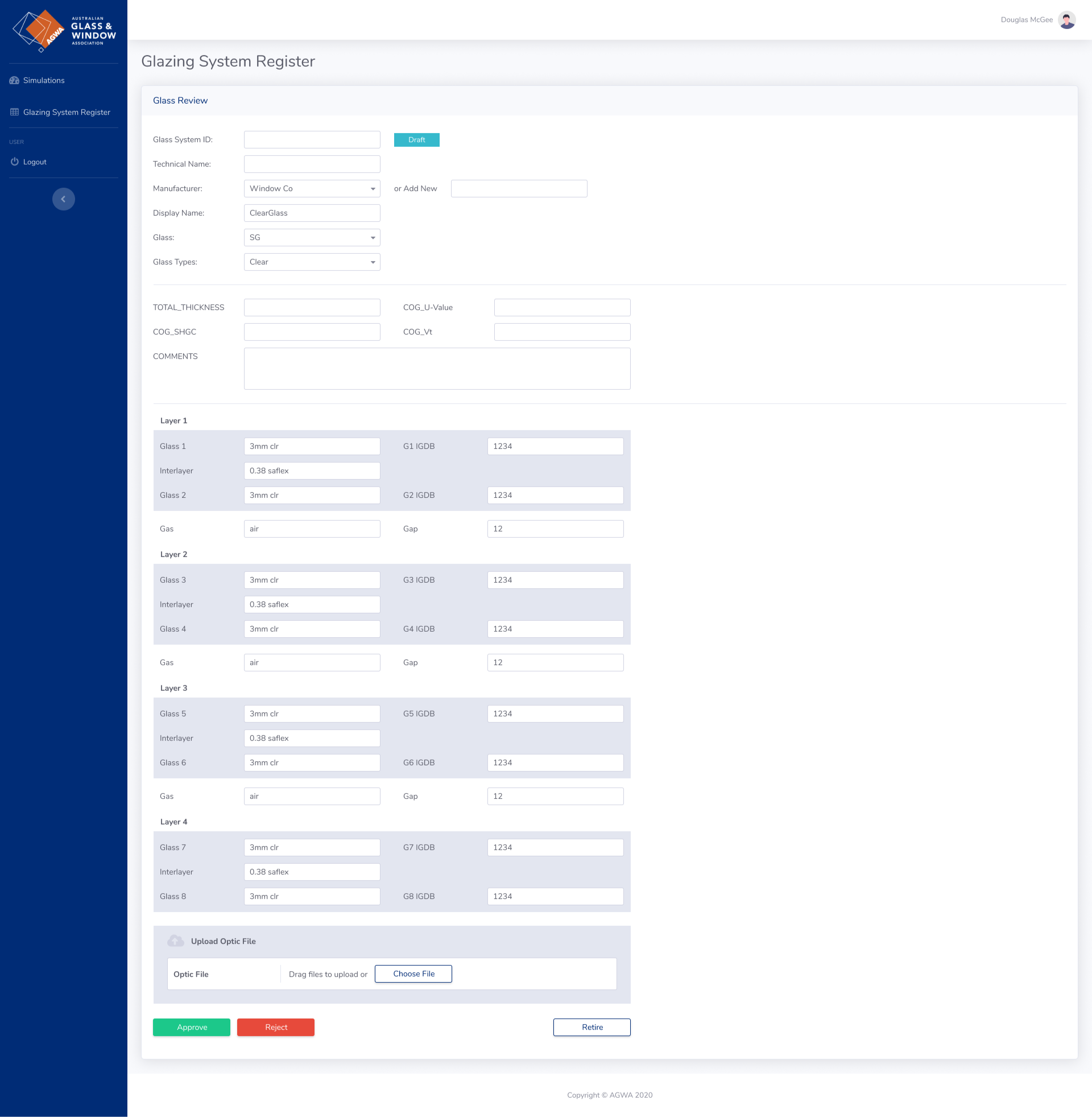
Glass Review - Detailed view for reviewing glass specifications. This screen needed to display complex technical data in a scannable format. I used tables with expandable rows for detailed specifications.
Collaboration & Testing
I ran weekly design reviews with the engineering team to ensure technical feasibility and fortnightly testing sessions with actual users. This collaborative approach prevented the classic designer-developer disconnect.
Key collaboration moment: Engineers initially wanted to use a generic data table component for all views. I pushed back because auditors needed custom comparison views and manufacturers needed guided forms. I built a clickable Figma prototype demonstrating the workflows, which convinced the team that custom components were worth the investment.
The prototype allowed users to test realistic workflows - uploading data, reviewing submissions, searching for performance data - before we wrote any code. This caught several navigation issues and unclear labels that would have required rework later
.
Results & Impact
Quantitative Outcomes
- 70% faster auditor reviews - Average review time dropped from 2-4 hours to 30-45 minutes per submission
- 3-day to same-day turnaround - Manufacturers received approval/rejection feedback within hours instead of days
- Eliminated email requests - Consumers accessed data directly through search, removing the request-and-wait bottleneck
- 95% data accuracy - Structured upload forms with validation reduced submission errors from ~30% to ~5%
Qualitative Feedback
From an auditor: "I can finally see all the data I need in one place. Before, I was jumping between emails, spreadsheets, and PDF reports. Now it's all structured and I can review submissions in a fraction of the time."
From a manufacturer: "The status tracking is brilliant. I know exactly where my submission is and what's needed if it's rejected. No more chasing people via email."
Business Impact
- Faster compliance - Architects and engineers could access verified performance data immediately, speeding up building consent applications
- Reduced support burden - Self-service access for consumers eliminated most support requests
- Scalable process - The platform could handle growing submission volumes without adding auditor headcount
Reflection
What Worked Well
Role-based design - Tailoring interfaces to each user type was the right call. Users found their workflows intuitive without needing to understand the full system.
Early wireframe testing - Catching the multi-step form issue before development saved weeks of rework.
Collaborative approach - Regular testing with actual users and close partnership with engineers prevented assumptions and technical dead-ends.
What I'd Do Differently
Mobile access - Research showed most users worked from laptops/PCs, so we prioritised desktop. But post-launch, some auditors wanted to review submissions on tablets, and a few manufacturers tried uploading data from phones. Despite the research outcome being desktop-focused, I should have designed responsive layouts from the start to accommodate edge cases.
Onboarding - We assumed users would understand the role-based structure immediately. Some manufacturers were confused about what they could and couldn't see. An interactive onboarding flow would have helped.
Key Takeaways
- Different users need different interfaces - Role-based design improved usability for everyone, even though it added complexity
- Structured data beats flexibility - Guided forms with validation prevented errors better than free-form uploads
- Test with real workflows - 15-minute usability tests didn't reveal issues that emerged during actual multi-hour work sessions
- Prototypes convince stakeholders - A clickable prototype was more persuasive than static mockups when advocating for custom components
Technical Implementation
Frontend: React, TypeScript
Backend: .NET, SQL Server
Design Tools: Figma for visual design, Axure for wireframes and prototypes, Miro for workshops
This project taught me that serving multiple user types well requires designing distinct experiences for each, not compromising with a one-size-fits-all interface. The role-based approach added complexity but delivered better outcomes for everyone.